Going beyond summary statistics
A course supplement
Datasaurus Introduction
I recently came across the Datasaurus dataset by Alberto Cairo on #TidyTuesday and wanted to create a series of charts illustrating the lessons associated with this dataset, primarily to: never trust summary statistics alone.
First, some context. Here’s Alberto’s original tweet from years ago when he created this dataset:

png
This tweet alone doesn’t communicate why we shouldn’t trust summary statistics alone, so let’s unpack this. First we’ll load the various packages and data we’ll use.
Load Packages
library(tidyverse)## ── Attaching packages ─────────────────────────── tidyverse 1.3.0 ──## ✓ ggplot2 3.3.2 ✓ purrr 0.3.4
## ✓ tibble 3.0.3 ✓ dplyr 1.0.1
## ✓ tidyr 1.1.1 ✓ stringr 1.4.0
## ✓ readr 1.3.1 ✓ forcats 0.5.0## ── Conflicts ────────────────────────────── tidyverse_conflicts() ──
## x dplyr::filter() masks stats::filter()
## x dplyr::lag() masks stats::lag()library(ggcorrplot)
library(ggridges)Load Data
note : datasaurus and datasaurus_dozen are identical. The former is provided via #TidyTuesday, the latter from this research paper discussing more advanced concepts beyond the scope of this document (i.e., simulated annealing).
You’ll also note that datasaurus_dozen and datasaurus_wide are the same data, organized differently. The former in long format and the latter, in wide format - see here for details.
For the most part, we’ll use datasaurus_dozen throughout this document. We’ll use datasaurus_wide when we get to the correlation section.
datasaurus <- readr::read_csv('https://raw.githubusercontent.com/rfordatascience/tidytuesday/master/data/2020/2020-10-13/datasaurus.csv')## Parsed with column specification:
## cols(
## dataset = col_character(),
## x = col_double(),
## y = col_double()
## )datasaurus_dozen <- read_tsv('./data/DatasaurusDozen.tsv')## Parsed with column specification:
## cols(
## dataset = col_character(),
## x = col_double(),
## y = col_double()
## )datasaurus_wide <- read_tsv('./data/DatasaurusDozen-wide.tsv')## Warning: Duplicated column names deduplicated: 'away' => 'away_1' [2],
## 'bullseye' => 'bullseye_1' [4], 'circle' => 'circle_1' [6], 'dino' =>
## 'dino_1' [8], 'dots' => 'dots_1' [10], 'h_lines' => 'h_lines_1' [12],
## 'high_lines' => 'high_lines_1' [14], 'slant_down' => 'slant_down_1' [16],
## 'slant_up' => 'slant_up_1' [18], 'star' => 'star_1' [20], 'v_lines'
## => 'v_lines_1' [22], 'wide_lines' => 'wide_lines_1' [24], 'x_shape' =>
## 'x_shape_1' [26]## Parsed with column specification:
## cols(
## .default = col_character()
## )## See spec(...) for full column specifications.Eyeballing the data
Here are the first six rows of datasaurus_dozen (long):
## # A tibble: 6 x 3
##   dataset     x     y
##   <chr>   <dbl> <dbl>
## 1 dino     55.4  97.2
## 2 dino     51.5  96.0
## 3 dino     46.2  94.5
## 4 dino     42.8  91.4
## 5 dino     40.8  88.3
## 6 dino     38.7  84.9
Here are the first six rows of datasaurus_wide (wide):
## # A tibble: 6 x 26
##   away  away_1 bullseye bullseye_1 circle circle_1 dino  dino_1 dots  dots_1
##   <chr> <chr>  <chr>    <chr>      <chr>  <chr>    <chr> <chr>  <chr> <chr>
## 1 x     y      x        y          x      y        x     y      x     y
## 2 32.3… 61.41… 51.2038… 83.339776… 55.99… 79.2772… 55.3… 97.17… 51.1… 90.86…
## 3 53.4… 26.18… 58.9744… 85.499817… 50.03… 79.0130… 51.5… 96.02… 50.5… 89.10…
## 4 63.9… 30.83… 51.8720… 85.829737… 51.28… 82.4359… 46.1… 94.48… 50.2… 85.46…
## 5 70.2… 82.53… 48.1799… 85.045116… 51.17… 79.1652… 42.8… 91.41… 50.0… 83.05…
## 6 34.1… 45.73… 41.6832… 84.017940… 44.37… 78.1646… 40.7… 88.33… 50.5… 82.93…
## # … with 16 more variables: h_lines <chr>, h_lines_1 <chr>, high_lines <chr>,
## #   high_lines_1 <chr>, slant_down <chr>, slant_down_1 <chr>, slant_up <chr>,
## #   slant_up_1 <chr>, star <chr>, star_1 <chr>, v_lines <chr>, v_lines_1 <chr>,
## #   wide_lines <chr>, wide_lines_1 <chr>, x_shape <chr>, x_shape_1 <chr>
There are 13 variables, each with X- and Y- axes.
Summary Statistics
First, we’ll note that if we just look at summary statistics (i.e., mean and standard deviation), we might conclude that these variables are all the same. Moreover, within each variable, x and y values have very similarly low correlations at ranging from -0.06 to -0.07.
datasaurus_dozen %>%
    group_by(dataset) %>%
    summarize(
        x_mean = mean(x),
        x_sd = sd(x),
        y_mean = mean(y),
        y_sd = sd(y),
        corr = cor(x,y)
    )
## `summarise()` ungrouping output (override with `.groups` argument)## # A tibble: 13 x 6
## dataset x_mean x_sd y_mean y_sd corr
## <chr> <dbl> <dbl> <dbl> <dbl> <dbl>
## 1 away 54.3 16.8 47.8 26.9 -0.0641
## 2 bullseye 54.3 16.8 47.8 26.9 -0.0686
## 3 circle 54.3 16.8 47.8 26.9 -0.0683
## 4 dino 54.3 16.8 47.8 26.9 -0.0645
## 5 dots 54.3 16.8 47.8 26.9 -0.0603
## 6 h_lines 54.3 16.8 47.8 26.9 -0.0617
## 7 high_lines 54.3 16.8 47.8 26.9 -0.0685
## 8 slant_down 54.3 16.8 47.8 26.9 -0.0690
## 9 slant_up 54.3 16.8 47.8 26.9 -0.0686
## 10 star 54.3 16.8 47.8 26.9 -0.0630
## 11 v_lines 54.3 16.8 47.8 26.9 -0.0694
## 12 wide_lines 54.3 16.8 47.8 26.9 -0.0666
## 13 x_shape 54.3 16.8 47.8 26.9 -0.0656Boxplots
You could use boxplots to show slight variation in the distribution and median values of these 13 variables. However, the mean values, indicated with the red circles, are identical.
datasaurus_dozen %>%
    ggplot(aes(x = dataset, y = x, fill = dataset)) +
    geom_boxplot(alpha = 0.6) +
    stat_summary(fun = mean, geom = "point", shape = 20, size = 6, color = "red", fill = "red") +
    scale_fill_brewer(palette = "Set3") +
    theme_classic() +
    theme(legend.position = 'none') +
    labs(
        y = '13 variables',
        x = 'X-values',
        title = "Boxplots: Slight differences in the distribution and median values (X-axis)",
        subtitle = "Identical mean values"
    )
## Warning in RColorBrewer::brewer.pal(n, pal): n too large, allowed maximum for palette Set3 is 12
## Returning the palette you asked for with that many colors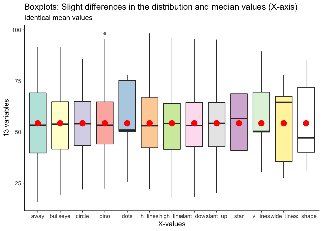
Here’s the same plot for y values:
datasaurus_dozen %>%
    ggplot(aes(x = dataset, y = y, fill = dataset)) +
    geom_boxplot(alpha = 0.6) +
    stat_summary(fun = mean, geom = "point", shape = 20, size = 6, color = "red", fill = "red") +
    scale_fill_brewer(palette = "Paired") +
    theme_classic() +
    theme(legend.position = 'none') +
    labs(
        y = '13 variables',
        x = 'Y-values',
        title = "Boxplots: Slight differences in the distribution and median values (Y-axis)",
        subtitle = "Identical mean values"
    )
## Warning in RColorBrewer::brewer.pal(n, pal): n too large, allowed maximum for palette Paired is 12
## Returning the palette you asked for with that many colors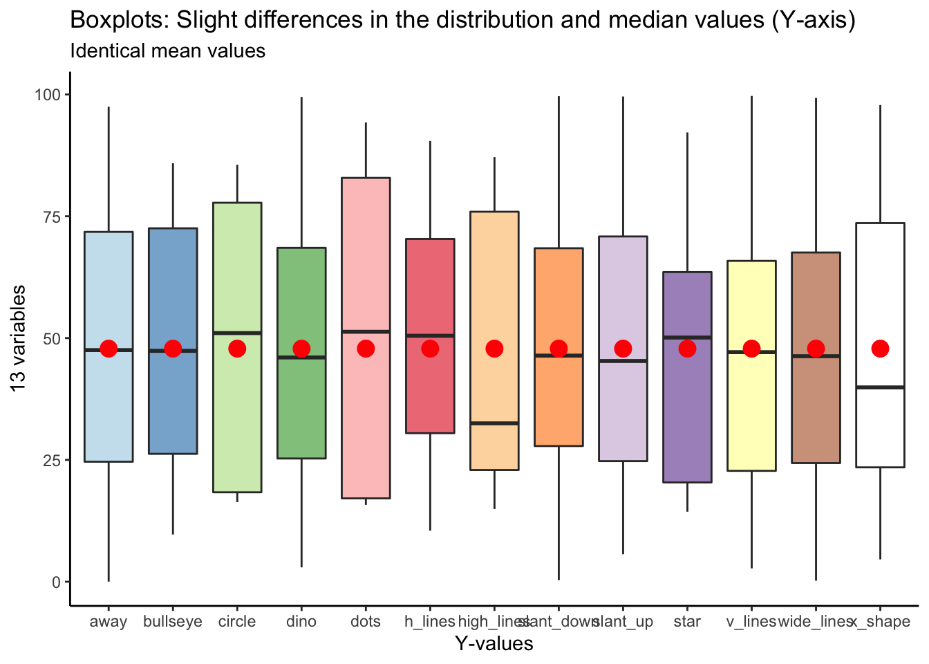
Ridgeline Plot
We can begin to get a sense for how these variables are different if we plot the distribution in different ways. The ridgeline plot begins to reveal aspects of the data that were hidden before.
We can begin to see that certain variables have markedly different distribution shapes (i.e., v_lines, dots, x_shape, wide_lines), while having the same mean value.
datasaurus_dozen %>%
    ggplot(aes(x = x, y = dataset, fill = dataset)) +
    geom_density_ridges_gradient(scale = 3, quantile_lines = T, quantile_fun = mean) +
    scale_fill_manual(values = c('#a6cee3', '#1f78b4', '#b2df8a', '#33a02c', '#fb9a99', '#e31a1c', '#fdbf6f', '#ff7f00', '#cab2d6', '#6a3d9a', '#ffff99', '#b15928', 'grey')) +
    theme_classic() +
    theme(legend.position = 'none') +
    labs(
        x = "X-values",
        y = "13 variables",
        title = "Ridgeline Plot: More variation in the distribution (X-axis)",
        subtitle = "Identical mean values"
    )
## Picking joint bandwidth of 5.46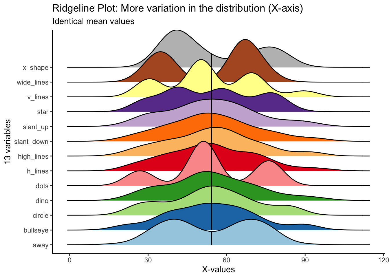
For y values, high_lines, dots, circle and star have obviously different distributions from the rest. Again, the mean values are identical across variables.
datasaurus_dozen %>%
    ggplot(aes(x = y, y = dataset, fill = dataset)) +
    geom_density_ridges_gradient(scale = 3, quantile_lines = T, quantile_fun = mean) +
    scale_fill_manual(values = c('#a6cee3', '#1f78b4', '#b2df8a', '#33a02c', '#fb9a99', '#e31a1c', '#fdbf6f', '#ff7f00', '#cab2d6', '#6a3d9a', '#ffff99', '#b15928', 'grey')) +
    theme_classic() +
    theme(legend.position = 'none') +
    labs(
        x = "Y-values",
        y = "13 variables",
        title = "Ridgeline Plot: More variation in the distribution (Y-axis)",
        subtitle = "Identical mean values"
    )
## Picking joint bandwidth of 9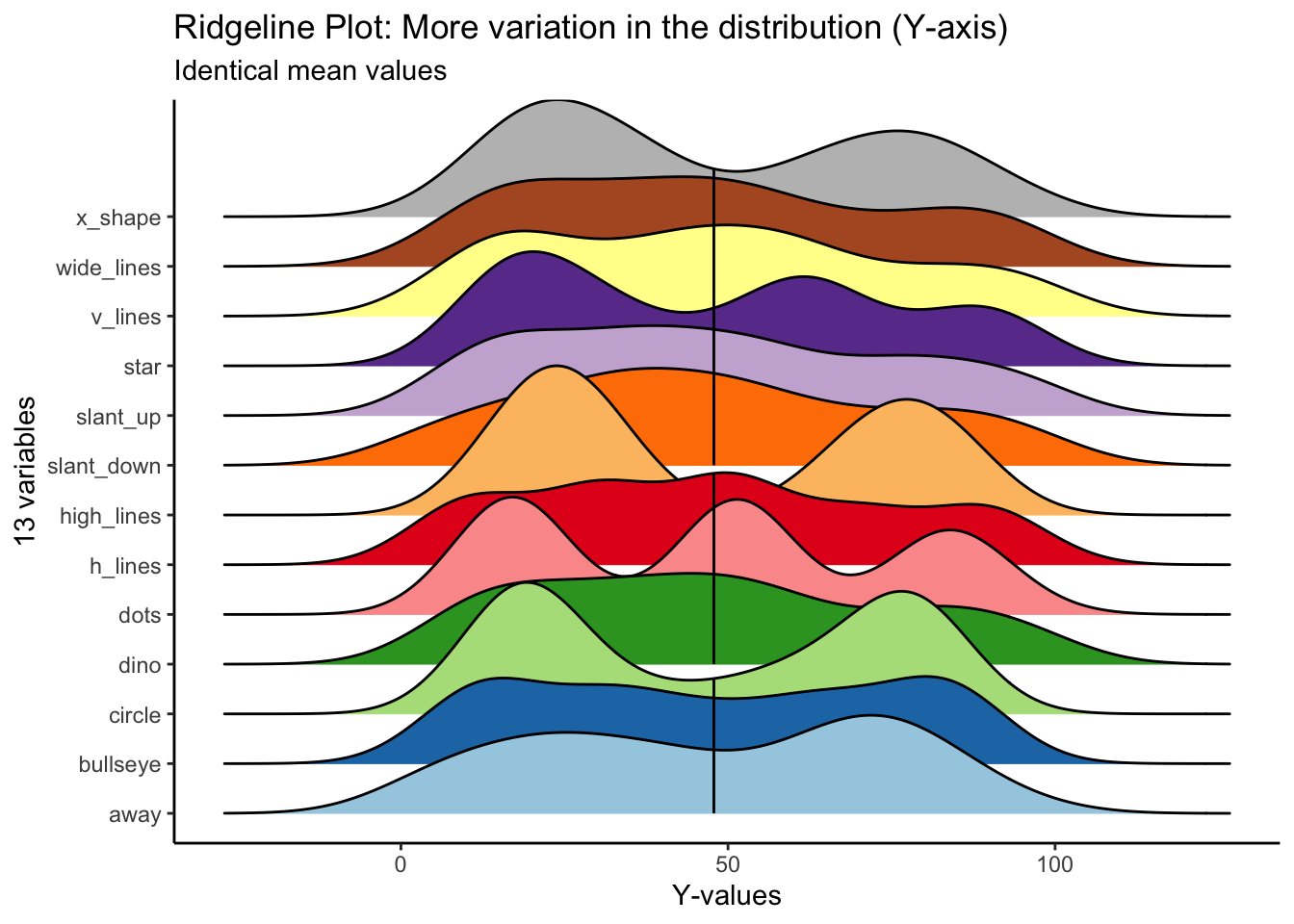
Correlations
If you skip visualizing the distribution and central tendencies and go straight to seeing how the variables correlate with each other, you could also miss some fundamental differences in the data.
In particular, the x and y values across all 13 variables are highlight correlated. With just knowledge of the summary statistics, one could be led to believe that these variables are highly similar.
Below is an abbreviated correlation matrix.
library(ggcorrplot)

# X-values
# selecting rows 2-143
# turning all values from character to numeric
datasaurus_wide_x <- datasaurus_wide %>%
    slice(2:143) %>%
    select(away, bullseye, circle, dino, dots, h_lines, high_lines, slant_down, slant_up, star, v_lines, wide_lines, x_shape) %>%
    mutate_if(is.character, as.numeric)

# Y-values
# selecting rows 2-143
# turning all values from character to numeric
datasaurus_wide_y <- datasaurus_wide %>%
    slice(2:143) %>%
    select(away_1, bullseye_1, circle_1, dino_1, dots_1, h_lines_1, high_lines_1, slant_down_1, slant_up_1, star_1, v_lines_1, wide_lines_1, x_shape_1) %>%
    mutate_if(is.character, as.numeric)


# correlation matrix for X values
corr_x <- round(cor(datasaurus_wide_x), 1)

# correlation matrix for Y values
corr_y <- round(cor(datasaurus_wide_y), 1)

head(corr_x[, 1:6])
## away bullseye circle dino dots h_lines
## away 1.0 -0.3 -0.3 -0.3 -0.3 -0.3
## bullseye -0.3 1.0 0.9 0.9 0.9 0.9
## circle -0.3 0.9 1.0 0.9 0.8 0.9
## dino -0.3 0.9 0.9 1.0 0.9 1.0
## dots -0.3 0.9 0.8 0.9 1.0 0.9
## h_lines -0.3 0.9 0.9 1.0 0.9 1.0Visualizing the correlation matrix
Here is a correlation between the x-values between all 13 variables. You can see that all variables, aside from away, are highly correlated with each other.
# correlation between X-values
ggcorrplot(corr_x, hc.order = TRUE,
           type="lower",
           outline.color = "white",
           ggtheme = ggplot2::theme_gray,
           colors = c("#d8b365", "#f5f5f5", "#5ab4ac"),
lab = TRUE) 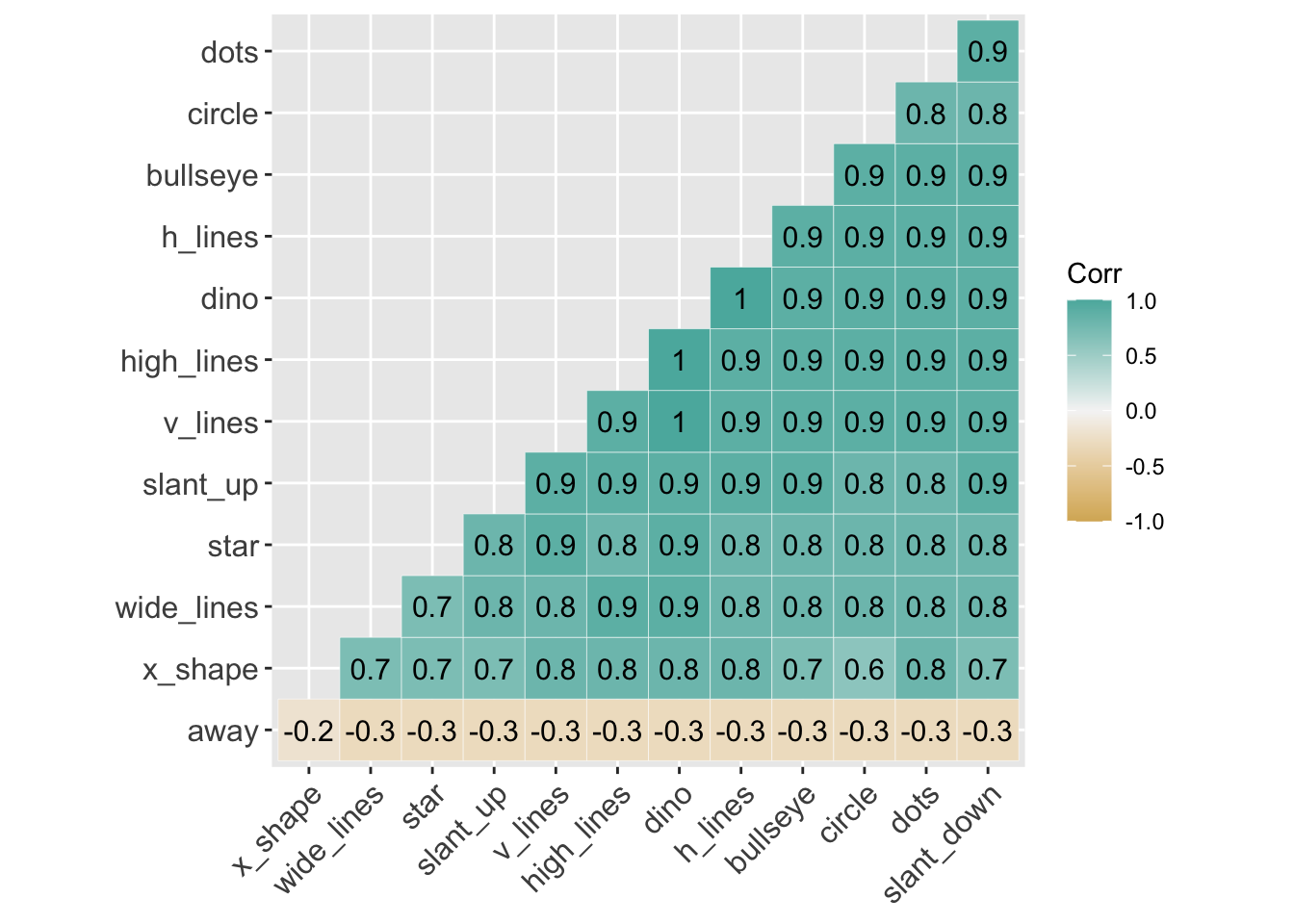
Here is a correlation between the ‘y-values’ between all 13 variables. Again, aside from away, all the variables are highly correlated with each other.
# correlation between Y-values
ggcorrplot(corr_y, hc.order = TRUE,
           type="lower",
           outline.color = "white",
           ggtheme = ggplot2::theme_gray,
           colors = c("#ef8a62", "#f7f7f7", "#67a9cf"),
           lab = TRUE)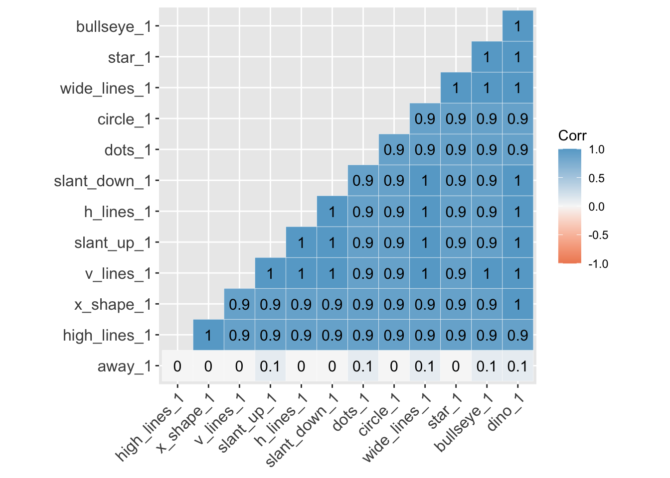
Facets
At this point, the boxplots show us variables with similar median and identical mean; the ridgelines begin to show us that some variables have different distributions. And the correlation matrix suggests the variables are more similar than not.
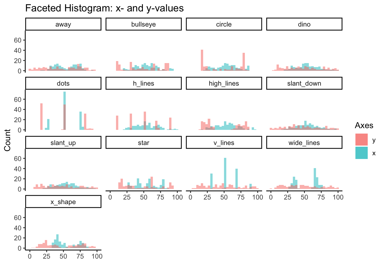
To really see their differences, we’ll need to use facet_wrap.
Here we’ll use facet_wrap to examine the histogram for x and y values of all 13 variables. We started to see the differences in distribution between variables from the ridgeline plots, but overlapping histograms provide another perspective.
# facet histogram (both-values)
datasaurus_dozen %>%
    group_by(dataset) %>%
    ggplot() +
    geom_histogram(aes(x=x, fill='red'), alpha = 0.5, bins = 30) +
    geom_histogram(aes(x=y, fill='green'), alpha = 0.5, bins = 30) +
    facet_wrap(~dataset) +
    scale_fill_discrete(labels = c('y', 'x')) +
    theme_classic() +
    labs(
        fill = 'Axes',
        x = '',
        y = 'Count',
        title = 'Faceted Histogram: x- and y-values'
    )
Scatter Plot
However, if there’s one thing this dataset is trying to communicate its that there’s no subtitute for plotting the actual data points. No amount of summary statistics, central tendency or distribution is going to replace plotting actually data points.
Once we create the scatter plot with geom_point, we see the big reveal with this dataset. That despite the similarities in central measures, for the most part similar distributions and high correlations, the 13 variables are wildly different from each other.
datasaurus_dozen %>%
    group_by(dataset) %>%
    ggplot(aes(x=x, y=y, color=dataset)) +
    geom_point(alpha = 0.5) +
    facet_wrap(~dataset) +
    scale_color_manual(values = c('#a6cee3', '#1f78b4', '#b2df8a', '#33a02c', '#fb9a99', '#e31a1c', '#fdbf6f', '#ff7f00', '#cab2d6', '#6a3d9a', '#ffff99', '#b15928', 'grey')) +
    theme_classic() +
    theme(legend.position = "none") +
    labs(
        x = 'X-axis',
        y = 'Y-axis',
        title = 'Faceted Scatter Plot'
    )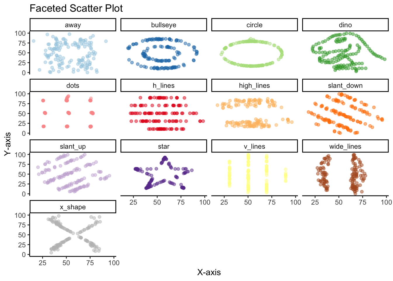
There are other less common alternatives to the scatter plot.
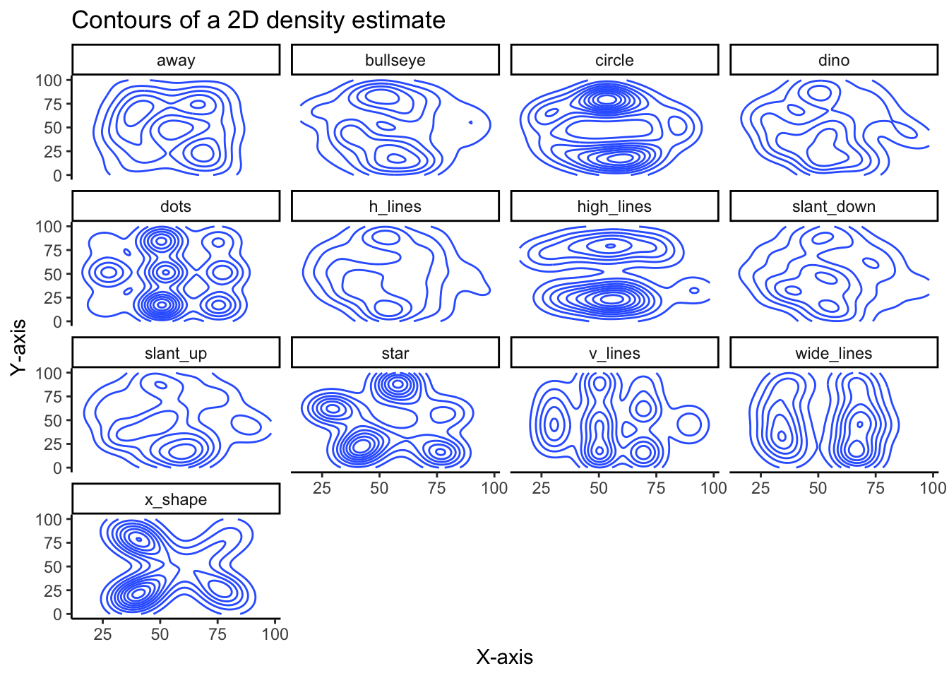
Geom Density 2D
While not as clear as the scatter plot, plotting the contours of a 2D density estimate does show how very different the variables are from each other, despite similar summary statistics.
# contours of a 2D Density estimate
datasaurus_dozen %>%
    ggplot(aes(x=x, y=y)) +
    geom_density_2d() +
    theme_classic() +
    facet_wrap(~dataset) +
    labs(
        x = 'X-axis',
        y = 'Y-axis',
        title = 'Contours of a 2D density estimate'
    )
This is a slight variation using stat_density_2d:
# stat density 2d
datasaurus_dozen %>%
    ggplot(aes(x=x, y=y)) +
    stat_density_2d(aes(fill=y), geom = "polygon", colour = 'white') +
    theme_classic() +
    facet_wrap(~dataset) +
    labs(
        x = 'X-axis',
        y = 'Y-axis',
        title = 'Stat Density 2D estimate'
    )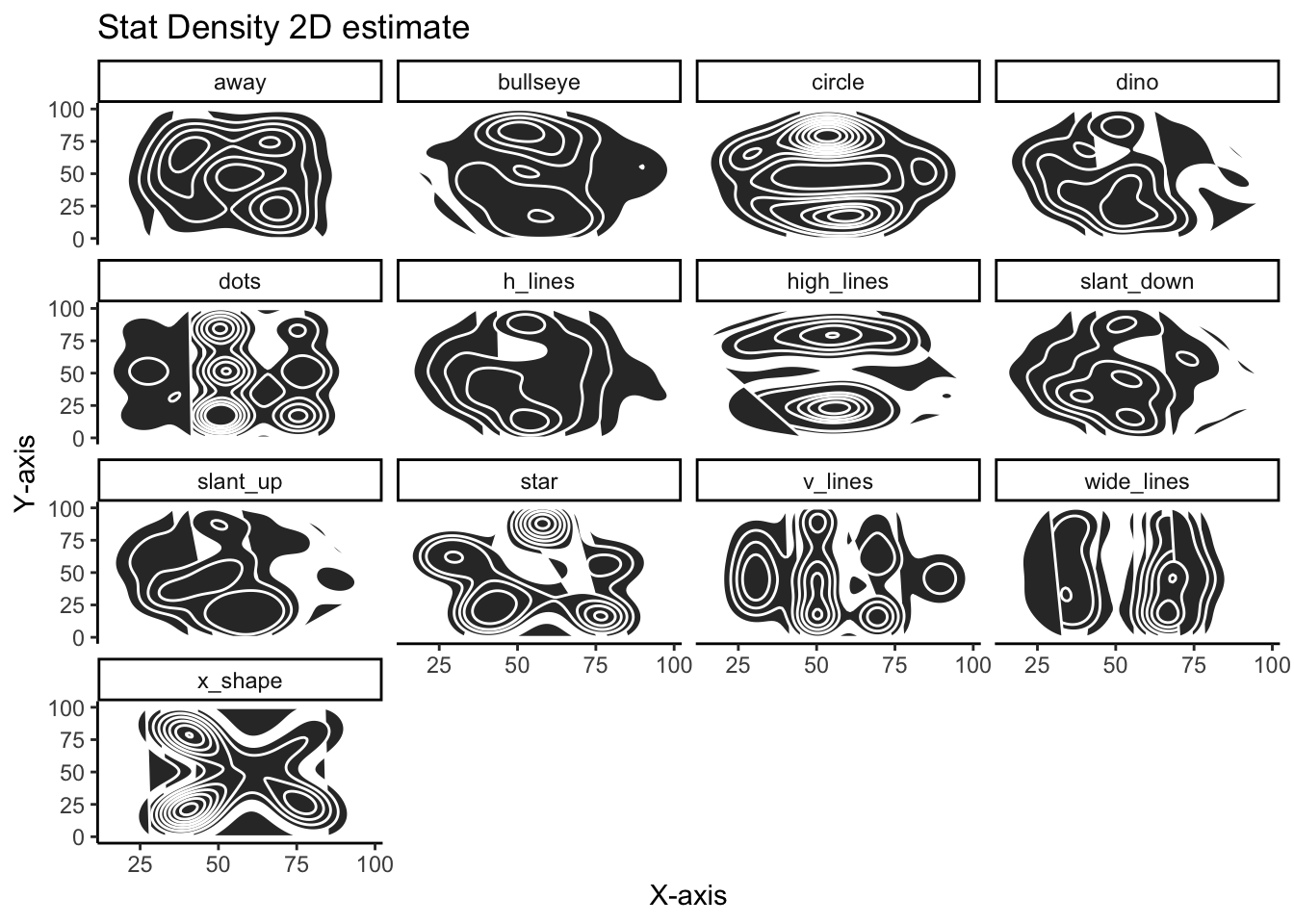
Using the density_2d plots are quite effective in showing how different the variables are and serve as a nice alternative to the more familiar scatter plot.
Hopefully this vignette illustrates the importance of never trusting summary statistics (alone). Moreover, when visualizing, we should go beyond simply visualizing the data’s distribution or central tendency, but plotting the actually data points.
Paul Apivat
Onchain data, DeFi, pipelines.